Beyond Pareo Scarf

Letters and Layers:
The Creative Canvas of Joanne Lim
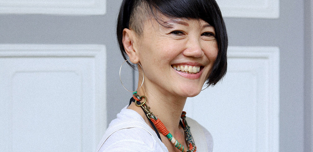
Meet Joanne, the talented artist behind The Letter J Supply (@theletterjsupply), whose journey from graphic design to calligraphy and abstract painting has been nothing short of transformative. Her dual approach — combining meticulous fine script with spontaneous brushwork — reflects her balanced creativity and evolving style.
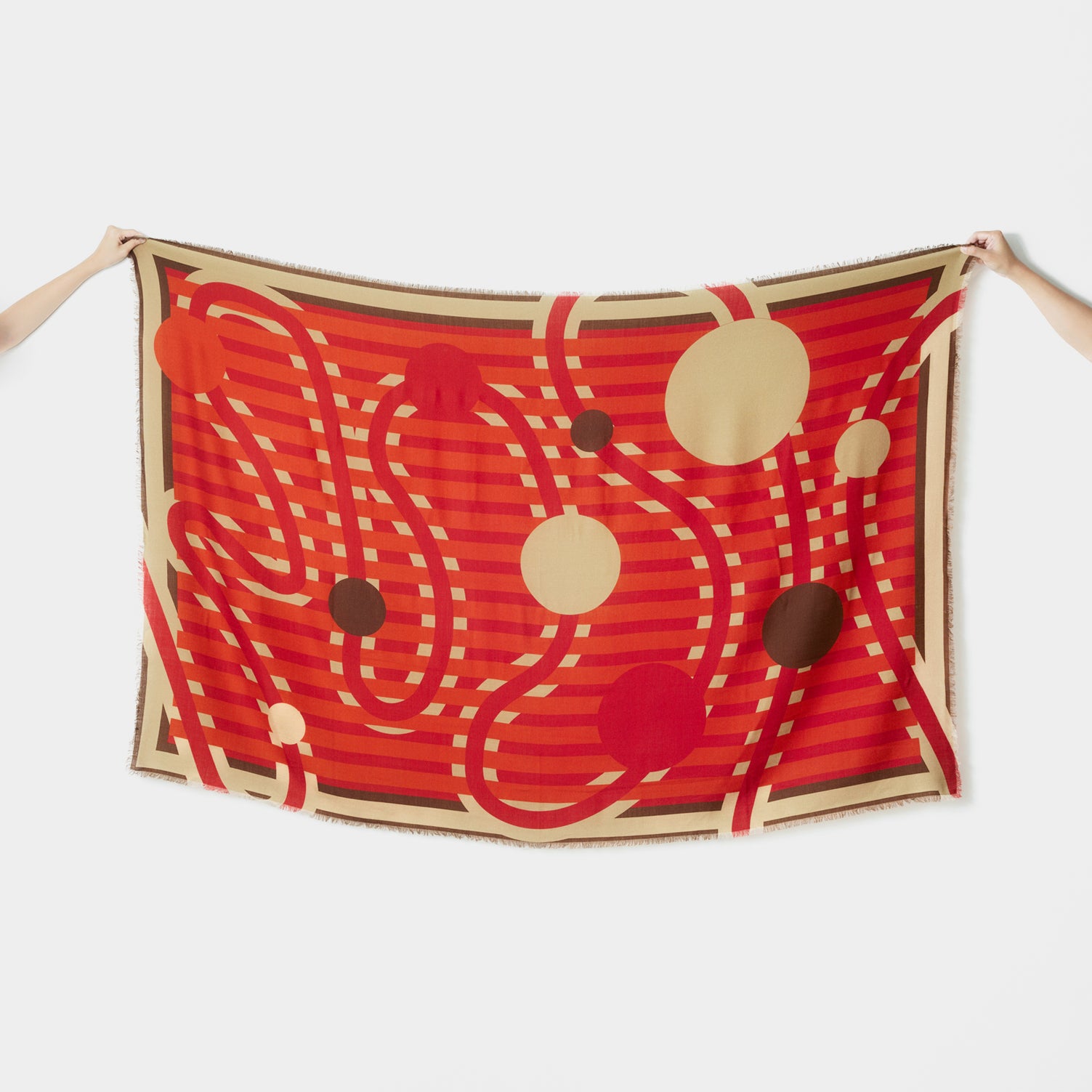
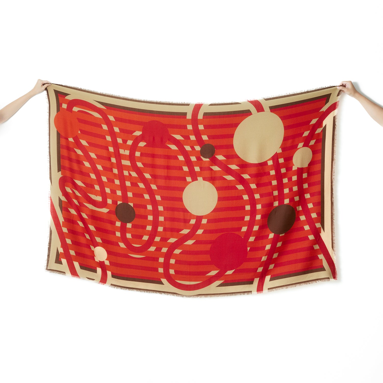
In this interview, Joanne takes us through her creative process, sharing the inspirations that drive her work. She also walks us through the design she created for Bynd Artisan’s 10th Anniversary collection, a piece symbolising progress and milestones, with each circle representing a year of growth and achievement.
Can you give us a short introduction of yourself?
Hi, I am Joanne. My current art practice is focused on abstract paintings.

Tell us about your journey. What led you to explore calligraphy, painting and other forms of art as your creative expression. How has your journey evolved over time?
As I look back, I see the natural progression of how one thing led to another. During the “O” Levels, I knew without a doubt that I wanted to study Visual Communications. It was one of those moments when I felt so sure about what I wanted to do. After graduation, I worked as a graphic designer for about 10 years. I tried my hand at publishing, advertising and working at design houses. I was most drawn to typography and experimental printing techniques. I had a boss who helped hone my crafting skills and opened my eyes to how design and art could be merged together.
During that time, a friend gifted me with set of beautiful calligraphy tools from Japan. I started experimenting with them, but I didn’t know the right techniques. Yet I knew there was something about them that captured my heart. It was the same feeling of “knowing”. On a soul-searching trip to New York, I took a calligraphy course and came back with some basic skills. An opportunity to rent a small shop space in Shaw Towers with friends came up, and I took a leap of faith. The space was where we could do whatever we wanted. It was then that my calligraphy journey took off. We transformed the space into a forest-like atmosphere, and I was customising messages in bottles with calligraphy.

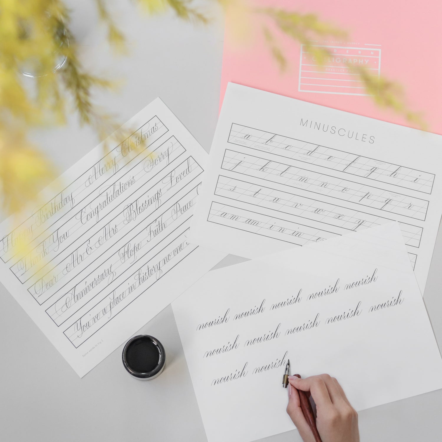
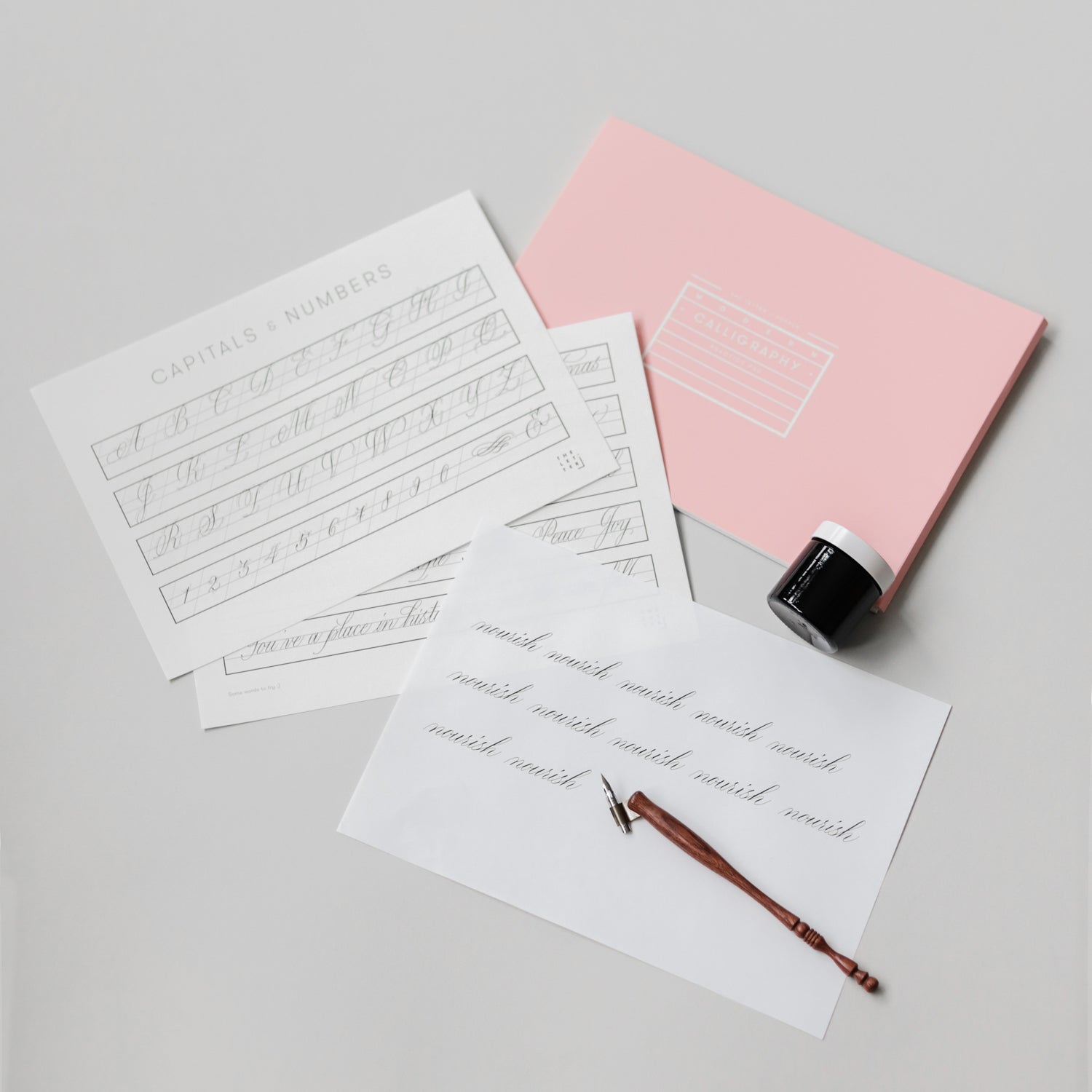
The Letter J Supply was born then. I had intended to try it out for just a year since that was the duration of our lease. However, it was the rise of the calligraphy movement so things picked up very quickly, and that one year became 10. I started to also teach calligraphy workshops. That’s where I got connected with Bynd Artisan, where I have been hosting calligraphy workshops and working on commissioned artwork for the last nine years.
I started my foray into abstract painting three years ago, and experimented with incorporating calligraphic elements into my paintings.
How has your artistic practice helped you discover new aspects of yourself creatively and personally?
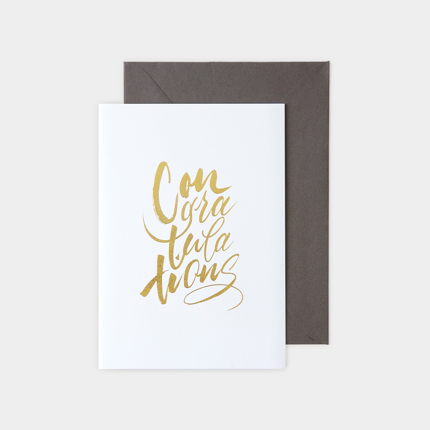
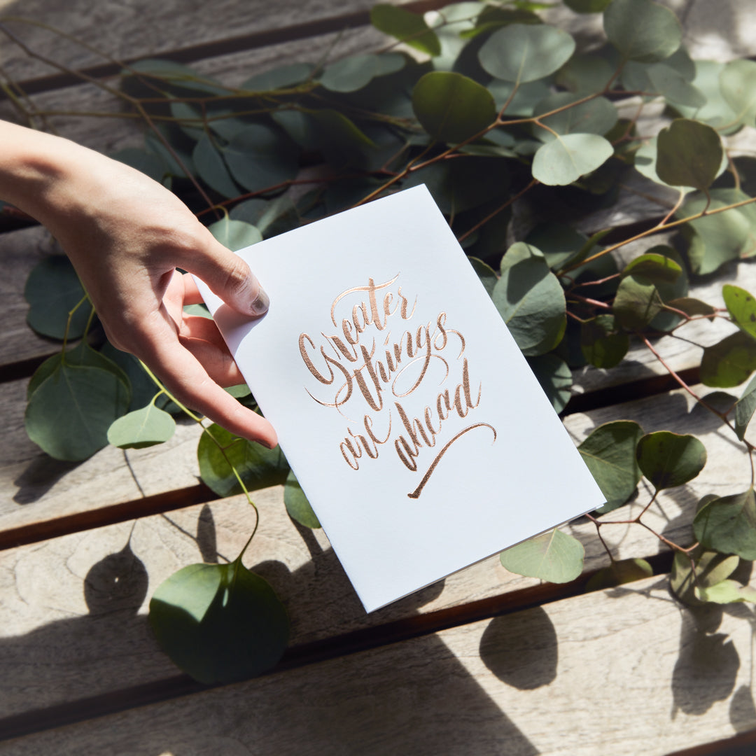
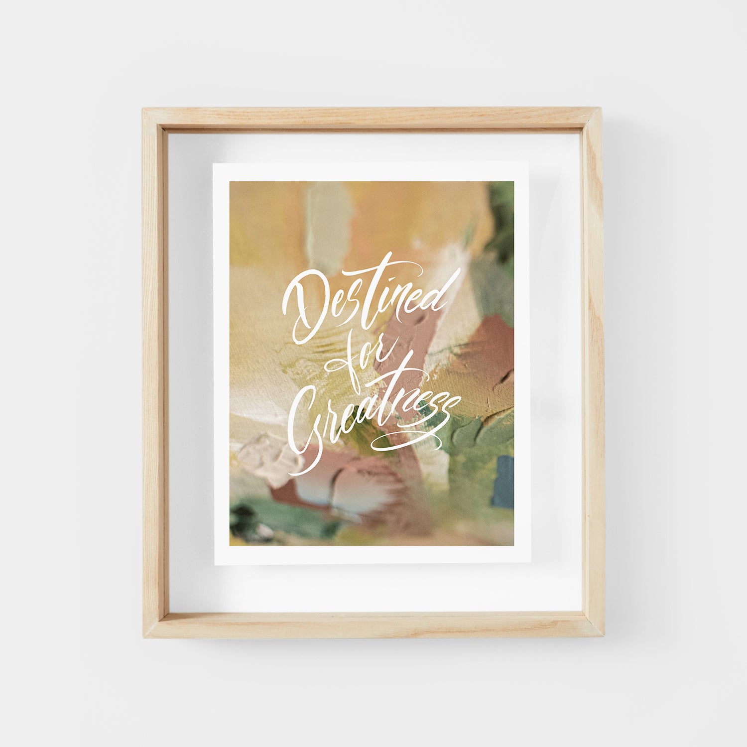
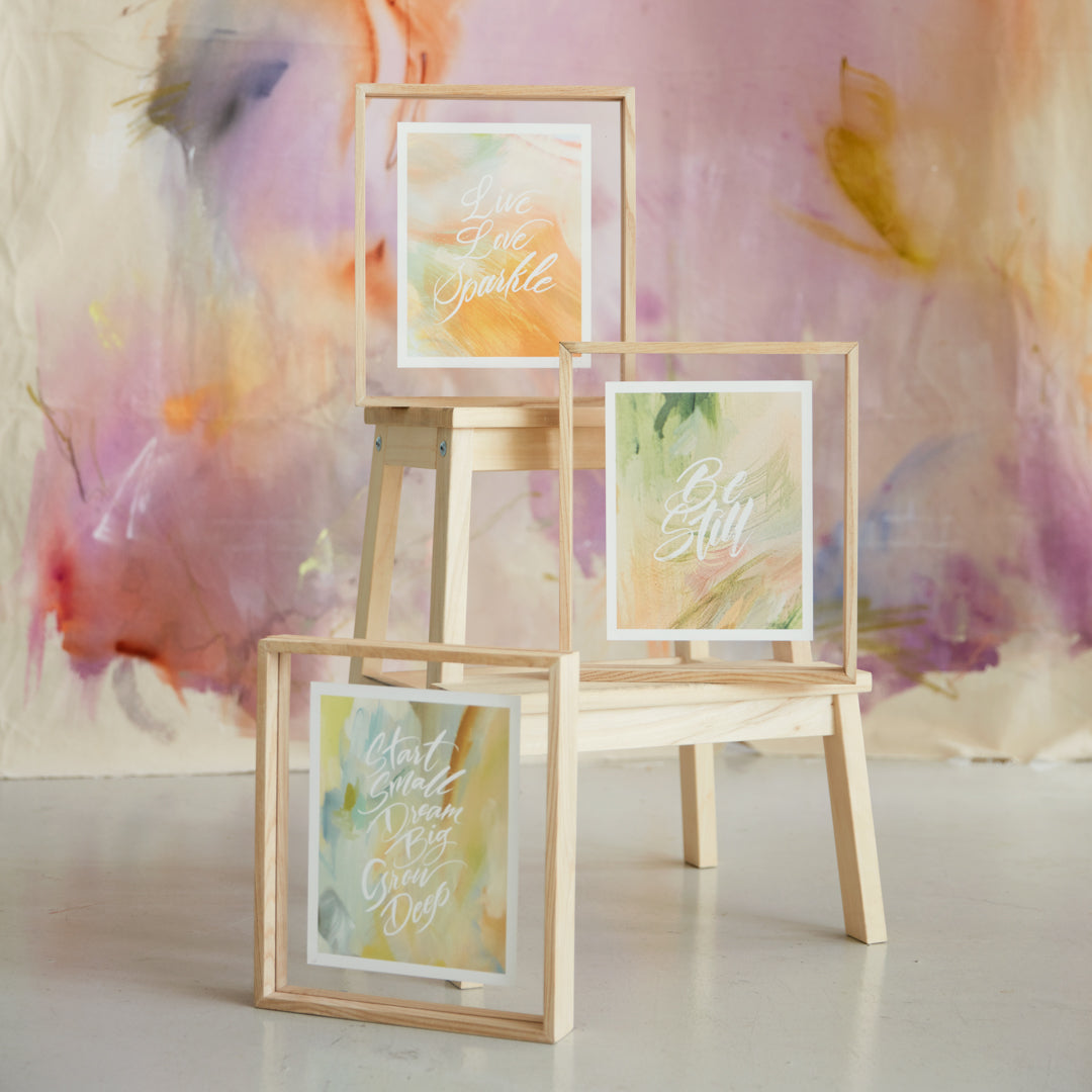
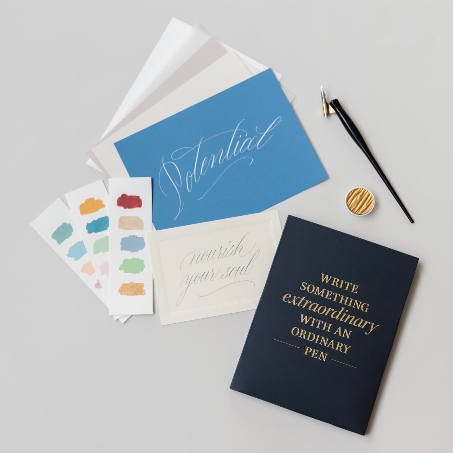
In the calligraphy phase, I had two distinct styles. The first was fine script with the nib and ink, where details were important and consistency was key. The other was brush in vibrant colours, which was very spontaneous and free.
I enjoyed both styles very much. There was a time where I was reflecting on what my voice was, and I couldn’t decide between the two. I concluded that I am both. I think they represent my personality. I have an introverted side and desire control of things, and there’s the side that is spontaneous and free-flowing.

Walk us through your creative process when designing and crafting a new piece whether it’s calligraphy or painting. Do you approach the mediums differently?
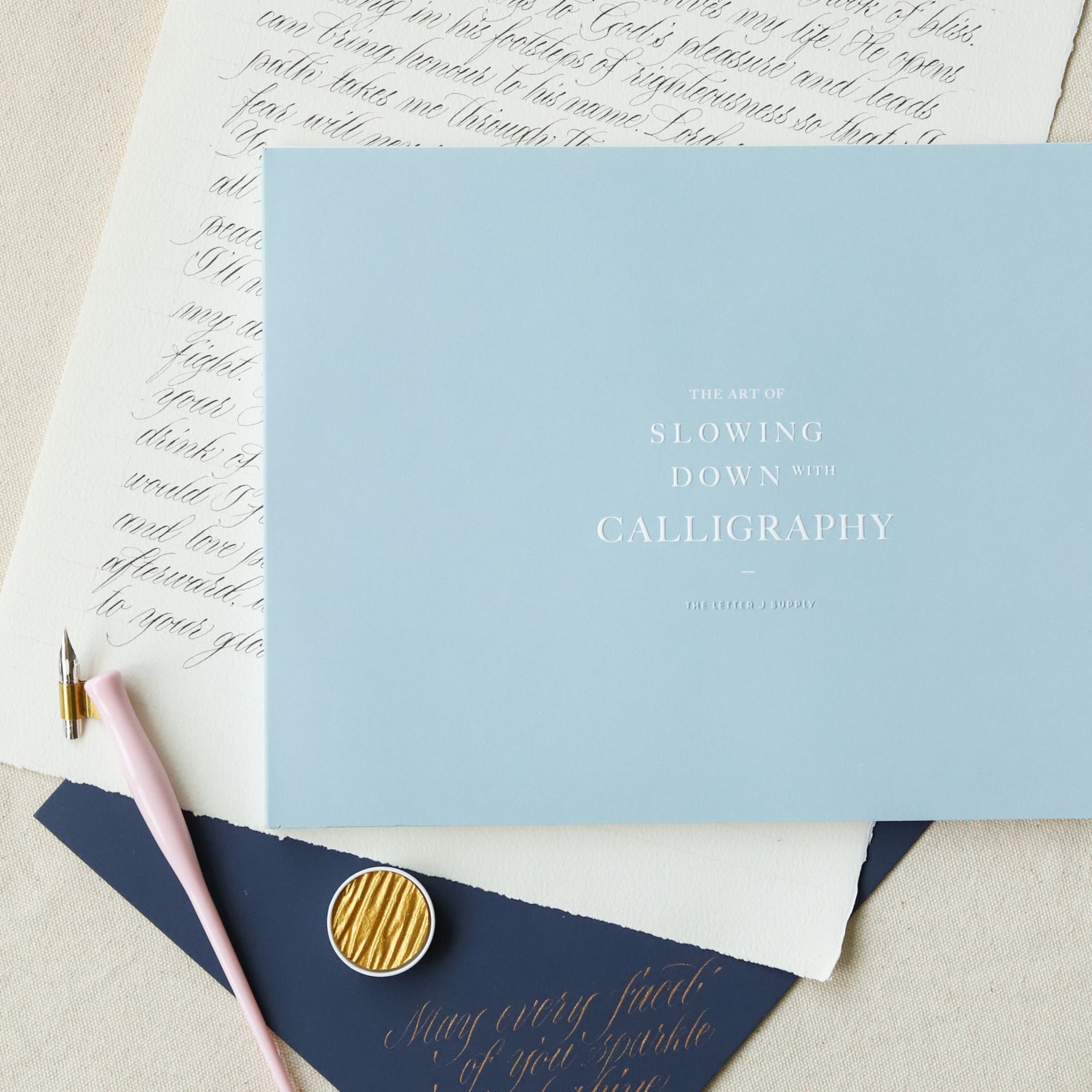
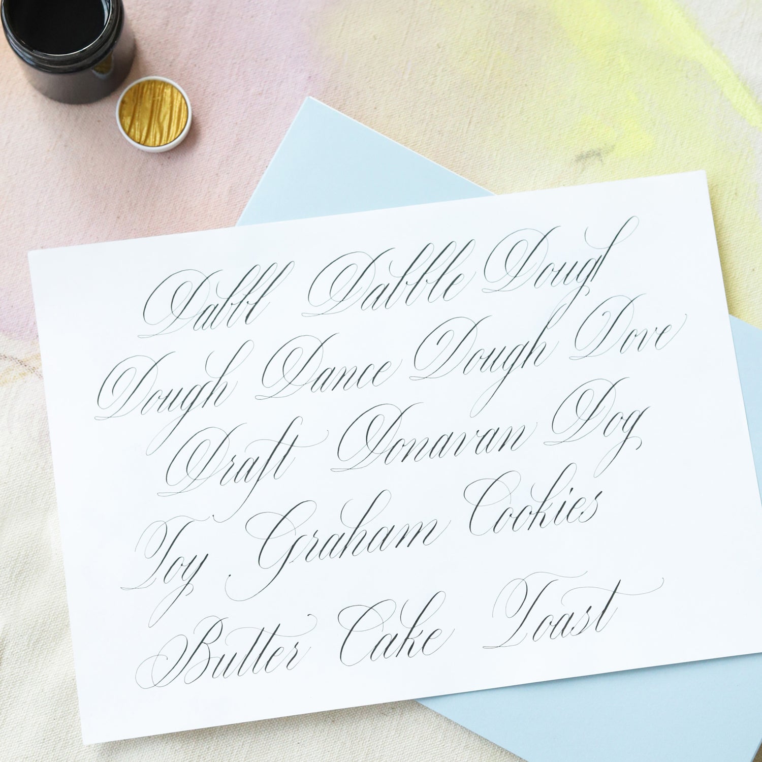
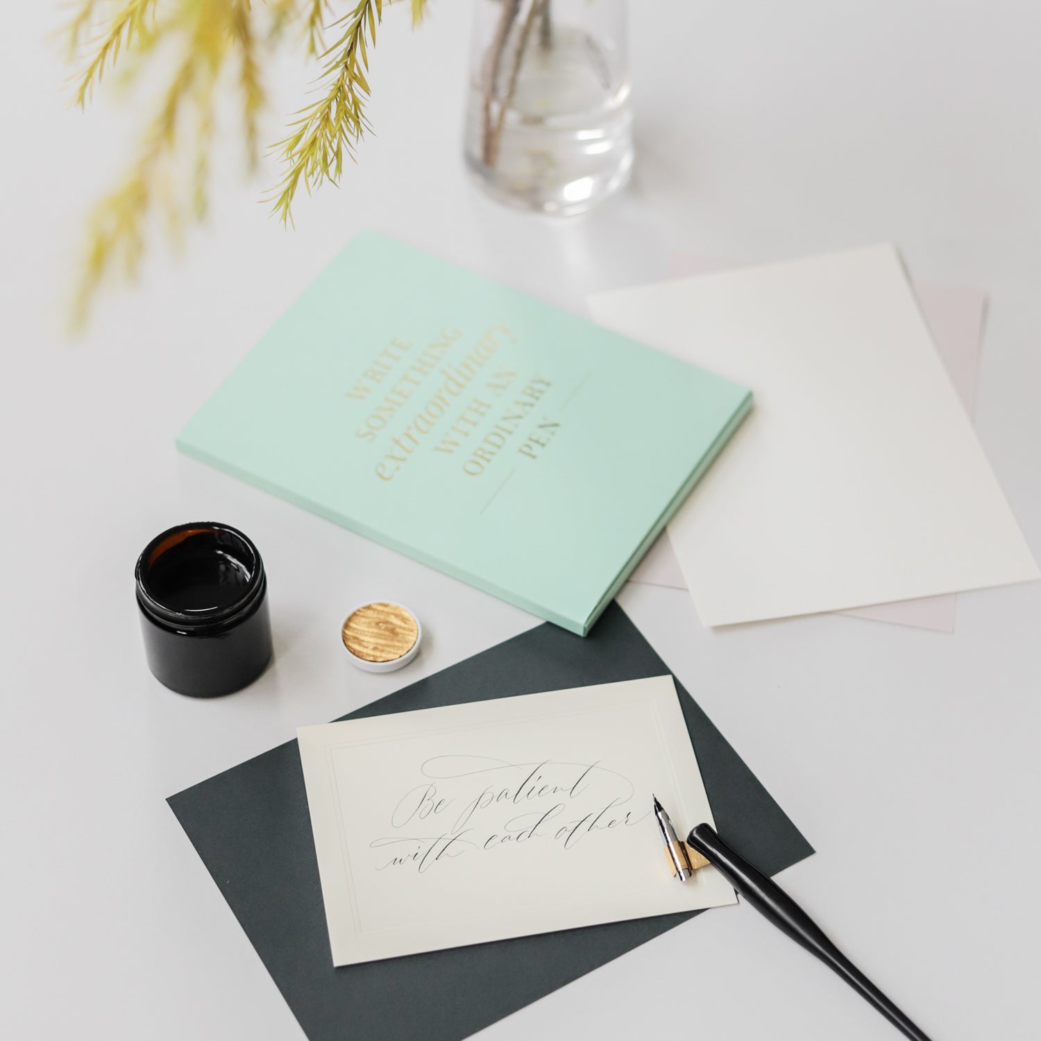
For calligraphy: In my “tool box”, I have a few different writing styles to convey the feeling of the message. Over the years I have developed a system with certain perimeters I have in mind before I start on a piece. For example, the number of words. I would decide which style to use based on that. If it’s a quote in brush style, it works best with seven words or less. If it’s a long passage, the fine script style would be more suitable for legibility. I have a few favourite types of paper that I use based on the medium. Cotton paper for brush calligraphy in water colour. Lightly textured thin paper for fine script calligraphy in black ink. I also make sure to choose the appropriate brush size based on the space and number of words.
For painting: I’m still continually developing my style and process. Because it’s more intuitive, the process is not standardised for every piece. I usually work on raw canvas, which I stretch on my own. I spend a whole day or afternoon just fixing up the frames and stretching the canvas over them. I would select a colour story and prepare the acrylic colours with different viscosities. There is a lot of layering and waiting for paint to dry in between. The final touches are oil sticks that add texture and details.
During the creating process, be it calligraphy or painting, having a design background comes in handy to determine space, composition and colours.

Is there any underlying meaning, theme or inspiration to the piece you made for “10 Years and Beyond” (10YAB)?
Ten years is a significant milestone, a good time to take stock of the journey. I designed the artwork as a reflection of Bynd Artisan’s milestones, big and small. Each circle representing a year, moving from glory to glory.
What message or feeling do you hope people take away when they see your works, especially the one crafted for “10YAB”? How do you hope to inspire others through your art?
As one wears the scarf, may it remind them to celebrate their own milestones in life.
I hope my art brings warmth to the viewer like a good friend who understands.

The Letter J Supply
View Products

